The isotope girls are basically stage personas for singers signed to KAMITSUBAKI STUDIO. There are quite a few of them, but this quintet that is getting CeVIO banks is their most popular group of singers that they've sometimes teamed up as a single unit under the "Virtual Witch Project" name.
There is some lore associated with all of the characters, and there's even a small game produced featuring the VWP singers.
I think what is more interesting to VOCALOID fans is that KAMITSUBAKI signs vocaloid producers to produce the albums for their singers. Kenzaki Iori produced both of KAF's albums, and after their release, they invited loads and loads of vocaloid producers to cover every song from each album. Basically, for these characters, the target audience is the very people that are already interested in vocal synths, which might explain why KAFU's popularity was so explosive. It also helps that the singers themselves, KAF in particular, have done well for themselves and garnered pretty wide appeal as far as "virtual singers" go. I don't know much else about KAMITSUBAKI itself, but I did really enjoy the remix albums in particular.
I hear and echo everyone's complaints about RIME and KAFU sounding too similar to each other, but I'm not sure I think their visuals are as similar as many have said. Both singers' designs have always been echoes/parallels of each other, and I think the designer did a good job of keeping their visual motifs similar while differentiating the color schemes, silhouettes, and costumes of the characters.
COKO and HARU should stand out the same way SEKAI stands out relative to KAFU and RIME, because despite all of them collaborating as VWP, RIM and KAF were the only vocalists intended to have the same motif/parallels.
EDIT: Here are the designs side by side. Extremely low quality image, lol. But it is late. Everyone is entitled to their opinion, but I really do think many have been too harsh on these two designs in particular.
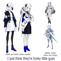
I like how KAFU and RIME share black and white, with inverted schemes, and they both have a contrasting color (red for RIME, yellow for KAFU). KAFU has a more chunky, extraterrestrial design while RIME's is more refined and incorperates those elements more like modern fashion. I really do think this is clever character design! I dunno!


 KAFU fans are a shoe-in to be RIME fans!


 I know it’s not impossible to get Kafu herself to sound like that (at least with outside editing), but as far as I can judge without access to either bank, it seems it’ll be a lot easier to get Rime to sound the way I’d want her to than Kafu, so her voice isn’t totally useless in my opinion.