ok so character design is definitely a thing i am into as in, career and whatnot, so i have many thoughts about many vocaloid designs... and ill briefly give my miku nt since thats the topic
i'd argue the design is good by itself, but whether or not people feel it "fits" in context to previous ones is kind of subjective- mostly when people are so attached/used it them. i jump with joy when companies actually try to stray from the mold, even if its just by a hair- and i think miku's change to more round/soft angles shows her "change" very well. i agree angular = futuristic and im nostalgic for that type of look, but i think the intention of changing her this way makes sense and lets the character deviate from what she once was. and i can understand them going for that due to Miku being taken away from Vocaloid as a title.
honestly everything about the design is practically the same minus some clothing details? so im surprised anyone is that unhappy- but i guess i dont find myself as attached when i purely come in with interest to a design changing, from an analytical point of view... so in summary: i think the design is well executed and honestly fitting for the changes theyre making to miku, even if they contrast the old ones i think its good for them to 'move on' design wise.
however i will get on this- as it made me think of your impression on the hair and mentioning the art. as much as i think ixima is a good artist, the way miku is presented (in terms of composition/pose) i don't feel shows off the design in the best way it could be shown....which takes me to the hair- i realized it when i glanced at the Macne Nana art above- but theres no real flow to the pose or hair, and i always felt the hair looked 'off' in some way. it might seem hard to understand but, basically Miku's pose is straight/flat... theres no real contrast to what her bundles of hair is doing in comparison to her body. and i'd say this is honestly why the hair looks like a bit much/off/disproportionate. a better pose would've let this flow in a way that seemed more realistic/easier to understand.
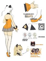
ill put a lil sketchy thing here to visualize this. while i have Macne as an example i could point out *many* other designs, who have "ridiculous" hair but is ultimately complimented by their pose.
and miku
Miku's arms are doing the only contrast here... which doesnt mean much when her hair is going all sorts of ways. i can see they wanted to imply the curly/waviness but visually give a good composition for the design itself. on a model sheet, sure-- but for art displaying the design, it just doesnt look
great imo. if the hair was drawn a certain way, to flow with a funky pose, it could've directed how the hair was presented. i think the hair "works" and its cute, just the way its presented on the art, doesn't direct it in the best way.
god sorry for the essay. i am passionate on my character design thoughts and i dont think youre incorrect for feeling like the hair looks off compared to other designs with wacky hair.