


Now if they can just get a demo with that style. Police Piccadilly made some good ONE songs and did KAFU's demo. I would really like to hear him make an IA or ONE demo.I like how both IA and ONE can be adjusted to sound either more cute or mature, and based on the short samples, it sounds like you can set IA in particular to sound more like her Vocaloid VB.


I thought I'd go into detail as to why the new design looks so much like Miku to a lot of people, because I think it's interesting from a character design perspective.
I think she follows the CV series design language very closely, and is the closest we've gotten to an commercial voicebank done in the style of a classic Crypton-inspired UTAU. IA takes the design principles of Miku and remixes them into her own colour scheme and personality.
Although it probably wasn't a good choice for IA (as it removes unique elements her fans are attached to), I should note that I'm not saying being inspired by Miku is necessarily a bad thing, or that this design wouldn't work if given to a new character.
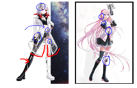
CeVIO IA has the same colour arrangement (black skirt, black cut-off sleeves, etc.) and silhouette as Miku, but what really makes the Miku inspiration clear are the details.

It's these elements, especially the coloured borders, that make a character feel like a Character Vocal. You can also see them in other voicebanks designed to look like they might be from Crypton, like Teto! (Note the skirt hem and shoe design)
I think she follows the CV series design language very closely, and is the closest we've gotten to an commercial voicebank done in the style of a classic Crypton-inspired UTAU. IA takes the design principles of Miku and remixes them into her own colour scheme and personality.
Although it probably wasn't a good choice for IA (as it removes unique elements her fans are attached to), I should note that I'm not saying being inspired by Miku is necessarily a bad thing, or that this design wouldn't work if given to a new character.
CeVIO IA has the same colour arrangement (black skirt, black cut-off sleeves, etc.) and silhouette as Miku, but what really makes the Miku inspiration clear are the details.
It's these elements, especially the coloured borders, that make a character feel like a Character Vocal. You can also see them in other voicebanks designed to look like they might be from Crypton, like Teto! (Note the skirt hem and shoe design)
Last edited:
Few of that trend can actually also be found in Hippi, minus the skirt but the jacket helm is also triangular with tight footwear and shoe heals. With the color scheme of Black, White and their respective color. But the way it's arranged makes it very different to recognize since Hippi does not wear a skirt.
She shows cleavage and have a fishnet on one leg and only one glove, mismatch boots, even the sleeve design is very different on one arm. Hippi can give Death the Kid an aneurism with how asymmetrical her outfit is.
IA have a more softer and generic school girl appearance with how much white and pink there is but if you look at all 3 of them side to side you can see some of the similarities, like how the "jacket parts" are white with border accents and have a triangular edge, the exposed midriff. The top is white while the bottom parts are black, the mismatch skin-tight boots or sock for ONE, the 1st place "symbols" repeating like 2-3 times; one on the leg, another on the top torso and one on the head.
But making them consistent, it kinda removed the parts that stands out on IA and made her look just too generic at first glance. Way to similar to Miku minus the neck tie or collar. Miku is the most recognizable Vocaloid design so almost everyone will always compare to her, even though her design is already generic in itself. Like how people compare all rock stars to Elvis
And I think it's also the way the art is done, Aka Akasaka have his own unique flair to his art. Like his own style that is recognizable.
Her white chunky boots are gone to match Hippi's tight boots, her pastel pink skirt color is changed so is her shirt/s. She still have her black sleeves but the design changed to look more chunky. Maybe it's just my opinion but it looks like he is trying to emulate Aka Akasaka's soft shading by the way her hair is drawn, but it's mixed too much with her/his own style, like the fact IA is actually standing while not staring blankly at you or floating.
I don't like to shame the artist on limiting themselves to the shadow of an existing artist, Aka Akasaka is a huge name. I laud her design on Hippi and I love how the artist did was given creative freedom so Hippi don't look like a generic Vocal Synth at all. But she can at least put more of that creative freedom on IA's outfit like how she did on Hippi's.
Last edited:
I agree, Hippi stands out more, and not onkly because of her gimmick, but because if you put her aside from fellow mature synth ladies, you can see who's who even if you're not from the fandom... Which is what I fear with Cevio AI IA (though she still stands out a bit but as said earlier, she's still closer to Miku and fellow cryptonloids)
Plus what is strange is that Hippi has her own aura, her own spark showing, while IA's original own character has lost a bit of its uniqueness with her own parts getting removed or changed to fit more another style
Plus what is strange is that Hippi has her own aura, her own spark showing, while IA's original own character has lost a bit of its uniqueness with her own parts getting removed or changed to fit more another style

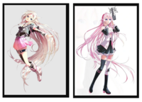
Looking at IA AI's design and IA's original design side by side makes IA AI look like a fanloid design. Some of the most recognizable parts of her design are gone now, big part of that being the changes in her hair. Original IA has way more volume, making her whole silhouette more interesting. More small hair strands that stick out, the short but full braids in the front that give volume to the side of her hair and of course the contrast of tight and chunky clothing (tight socks - big boots, tight tanktop - big t-shirt). All of that is gone, now she looks so.. straight lined from top to bottom which is just boring looking? There is no part of her design where my eyes are being drawn to.


Everything about IA (and by extension, 1st Place) truly baffles me.
When IA was originally released, it felt like 1st Place had a huge budget to throw into advertising her - huge name artist, huge name producers (Kagepro completely changed the course of the Vocaloid community whether one agrees it also was the cause of the fandom ""dying"" or not), it just felt like she was constantly snowballing into something bigger and larger.
Then we skip to now, and it's like... where did all that budget go? They got a ton of money to hold a virtual concert and the tickets weren't even cheap either, but it wasn't very good. The models honestly look really uncanny and... I hate to say it, but really cheap, and you can see that just from the reactions to those album covers in this thread.
That's not even going into IA's Japanese CeVIO AI bank now being confirmed to just be higher pitched than her Vocaloid banks on default. Can't say I've seen a single positive reaction to it from the Western community, but most of what I've seen from the Japanese community is positive... so I guess this is just another Kafu situation.
1st Place as a company also is very opaque in terms of communication - constant delays without an explanation (or even a notice in some cases, I feel like we've sometimes just went "wait weren't ONE and IA supposed to be out by now" and it turns out they were just silently delayed), whatever the hell happened with these figures a while back that they had to publicly apologize for (but no explanation on how it even turned out like that to begin with)..
I dunno. To me it just feels like seeing a company actively light themselves on fire in real time.


i havent commented here really as i feel like everyone above has really presented the opinion i also agree with regarding the designs. im honestly im awe? shock? the design is such a blatant miku inspiration. aside from that, that lacking quality mostly in presentation has been obvious.... i surely understand the ease in using 3D models but they dont look very nice and im not sure if they even have a budget to improve that considering how things keep looking. Cevio's development has already been poor and so seeing it combined with.... all of the above. yeah idk. and oh my god that figure... looks like a shitty 3d printed model (also saw kotaku wrote about this as well).
(will say i too like hippi's design which is a shame compared to the others... its more contrasting and "punk", more interesting to me. if only the others were more bold like that)
(will say i too like hippi's design which is a shame compared to the others... its more contrasting and "punk", more interesting to me. if only the others were more bold like that)
And ironically, even though ONE kinda got kawaii-ironed, at the same time and unlike IA's appearance, she keeps most of her elements like the short or the fully casual top (even though the tips turned into Miku's own shirt hem) even giving her a sporty vibe (not as sporty as her original, but still pretty close)
However as I said, with those new designs yeah, now only Hippi's seems to get enough character to stand out both along with her sisters and along with fellow 'loids or original characters
However as I said, with those new designs yeah, now only Hippi's seems to get enough character to stand out both along with her sisters and along with fellow 'loids or original characters

IA's new design is.
it's.
i...
Look, there's one thing being inspired by Miku, or wanting to have a classic vocalsynth-esque/famous cryptonloid look, but... it just aligns with Miku's design so perfectly that it almost looks stolen, or like some fanart of like 'WHAT IF IA WAS A CRYPTONLOUID?!??!1!"£"!2" kind of thing... guh.
The VBs are pretty good, I guess, although all cevio voicebanks seem to have this quality to them that make them all sound the same, outside of KAFU. I dunno... if it were an Utau, or even just a non-pre-established vocal, it wouldn't matter, but this is a well-known vocal from a big company.
...after the 'cyber ghetto' IA design, though, i don't really know what i expected.


It's been so depressing watching 1st Place go from being a trailblazer to... Whatever state it's currently in right now. They're a shadow of their former selves. So many questionable decisions regarding IA and ONE (I haven't been thrilled with the "moeblob" direction they seem to have taken with the characters, suffice to say), and right now Hippi seems to be a vtuber rather than a vocal synth, which is baffling considering how long she was stuck in development hell (perhaps that's why she was turned into a vtuber character?) and how she was initially promoted.Everything about IA (and by extension, 1st Place) truly baffles me.
When IA was originally released, it felt like 1st Place had a huge budget to throw into advertising her - huge name artist, huge name producers (Kagepro completely changed the course of the Vocaloid community whether one agrees it also was the cause of the fandom ""dying"" or not), it just felt like she was constantly snowballing into something bigger and larger.
Then we skip to now, and it's like... where did all that budget go? They got a ton of money to hold a virtual concert and the tickets weren't even cheap either, but it wasn't very good. The models honestly look really uncanny and... I hate to say it, but really cheap, and you can see that just from the reactions to those album covers in this thread.
That's not even going into IA's Japanese CeVIO AI bank now being confirmed to just be higher pitched than her Vocaloid banks on default. Can't say I've seen a single positive reaction to it from the Western community, but most of what I've seen from the Japanese community is positive... so I guess this is just another Kafu situation.
1st Place as a company also is very opaque in terms of communication - constant delays without an explanation (or even a notice in some cases, I feel like we've sometimes just went "wait weren't ONE and IA supposed to be out by now" and it turns out they were just silently delayed), whatever the hell happened with these figures a while back that they had to publicly apologize for (but no explanation on how it even turned out like that to begin with)..
I dunno. To me it just feels like seeing a company actively light themselves on fire in real time.
Warmed up to her voice a bit now that I can actually hear Lia in it (thank jesus for that) but the pitched up vocals being the default throws me off soooo badly. I could understand it for KAFU but the fact that IA in Vocaloid didn't sound like this by default just makes it :/ for me. At least the Alpha parameter isn't disabled for her, she sounds a lot more like what I expected when pitched down. ONE sounds pretty great though.
The designs are generic, I don't hate them but their default ones are far more iconic. Miku formula is very real here though as was pointed out already.
Definitely agree with 1st Place becoming a shadow of their former selves too. I used to think they were one of the few non Crypton companies that really got it when it comes to marketing their vocaloid but they've dropped the ball pretty hard in recent years. I specially miss the really good compilation albums they used to do. They've taken them in too different of a direction from Vocaloid culture for me, idk
After seeing the two designs side by side… I’m reminded of why I loved the original IA so much and why I this one evokes so little emotion in me. The new design isn’t bad, but it lacks a lot of the original IA’s identity— the pure pink hair is what sticks out to me most, actually.
IDK. I wonder what happened. It really is not a bad design, but IA has definitely shifted directions, as people have mentioned countless times in the past.
IDK. I wonder what happened. It really is not a bad design, but IA has definitely shifted directions, as people have mentioned countless times in the past.
Yeah, and while I do enjoy her tone, the fact that like many people here I've always been used to her Vocaloid tone, it is sooooo different it feels like another character... It is a shame because I personally like her english (among the liveliest I've heard so far all synths concerned) and her tone is cool too but still, as I'm repetating myself, it doesn't sound like herself....
In fact, I guess it'd be more enjoyable if this kind of voice was done onto a brand new character (one that could pander to more cutesy / "kawaii urban" now granted onto IA, while IA herself would remain the mysterious one, -H-/HIPPI the now rockish, yet still even much more mysterious, and ONE sticking to her original underground urban-styled background) so it'd fit more and overall, people would warm up more easily onto it with no prejudices or expectations
Regarding ONE, it isn't the same thing since anyway, her voice has always been higher-pitched than IA's Vocaloid (while being slightly tomboyish like IA ROCKS was) as being assumed as the younger sibling (until they suddenly changed it as being a twin thing or something) and also because she's been so far the only CeVIO Native from 1st Place so there is no past self to compare with in... the first place (sorry for that random accidental joke)
And as you said @blackout, it is a good thing they let the Alpha parameter so at least, people could try getting a little bit closer to her original tone instead of being genderpitch-locked like with KAFU (And it's better that way because imagine the giant backlash it could have brought, stirring up the fire ](.-.)[ )
After listening to IA Cevio and IA_V3. I can tell the difference is mostly due to the technology used to develop it. Yamaha have a different technology, as a result all their products have that district aftersound signature at the end of each word if you listen very, very carefully.
It's like after hearing Voicreroid for a long time, you realize there is some sort of aftersound noise that is present in all their products.
But the pronunciation wise IA sounds like she is opening her mouth more widely when saying stuff, than limiting to the tone of an opera-singer. I'm not complaining but I will always prefer the alpha parameters be set to +8.00.
Though following the JP market, I still expect someone to release a reloaded Cafe Latte, or something similar to that tone in the future. And I once confused IA as a pitch-up Luka/Rin first hearing it.
Last edited:


I don't think it has to do with the technology, honestly. Different engines produce different outcomes, but Yukari, for example, sounds near-identical in both Vocaloid and CeVIO. Her CeVIO bank differs only in its noise and warbled automated pitch. If IA were still being directed in the same way as her Vocaloid banks, the two banks wouldn't be that different in the end. I think it's reasonable to say that she's being voice-acted (or at least voiced) to be significantly more "cutesy" than her Vocaloid bank.After listening to IA Cevio and IA_V3. I can tell the difference is mostly due to the technology used to develop it. Yamaha have a different technology, as a result all their products have that district aftersound signature at the end of each word if you listen very, very carefully.


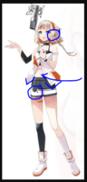
I think they wanted to go with a spaghetti theme for her Eng designI went to take closer look at the IA 3D render and:
I'm trying to look whether they posted the picture somewhere else but I had the video on as high of a resolution as possible ( 1080p ) and......didn't they do piss poor job at denoising it, it literally looks like quick test render, not a final one,
what is that pink miku wtf
What I don't understand is why they want to deviate so much from the original IA, both in voice and design.
I mean, that IA that actually sounds like Lia, with that cool and standout design was the one that brought them to fame among synth vocals (and in their prime, I might add, when the competition was fierce).
I didn't know about this new IA Cevio thing. Last I heard, they were bringing out a third voice called HIPPI. And as someone exposed for the first time to all this, my first thought is that the voice (IA Cevio JP) sounds extremely generic and the design is almost a joke.
Why dilute them so much?
Hippi doesn't even appear to be a synth after all, just a vtuber. Like I've said before, 1st Place seems to be confusing everyone with terrible decisions.I didn't know about this new IA Cevio thing. Last I heard, they were bringing out a third voice called HIPPI.
I wish that they have used the Talk designs for the singing banks. Like, they were so good